
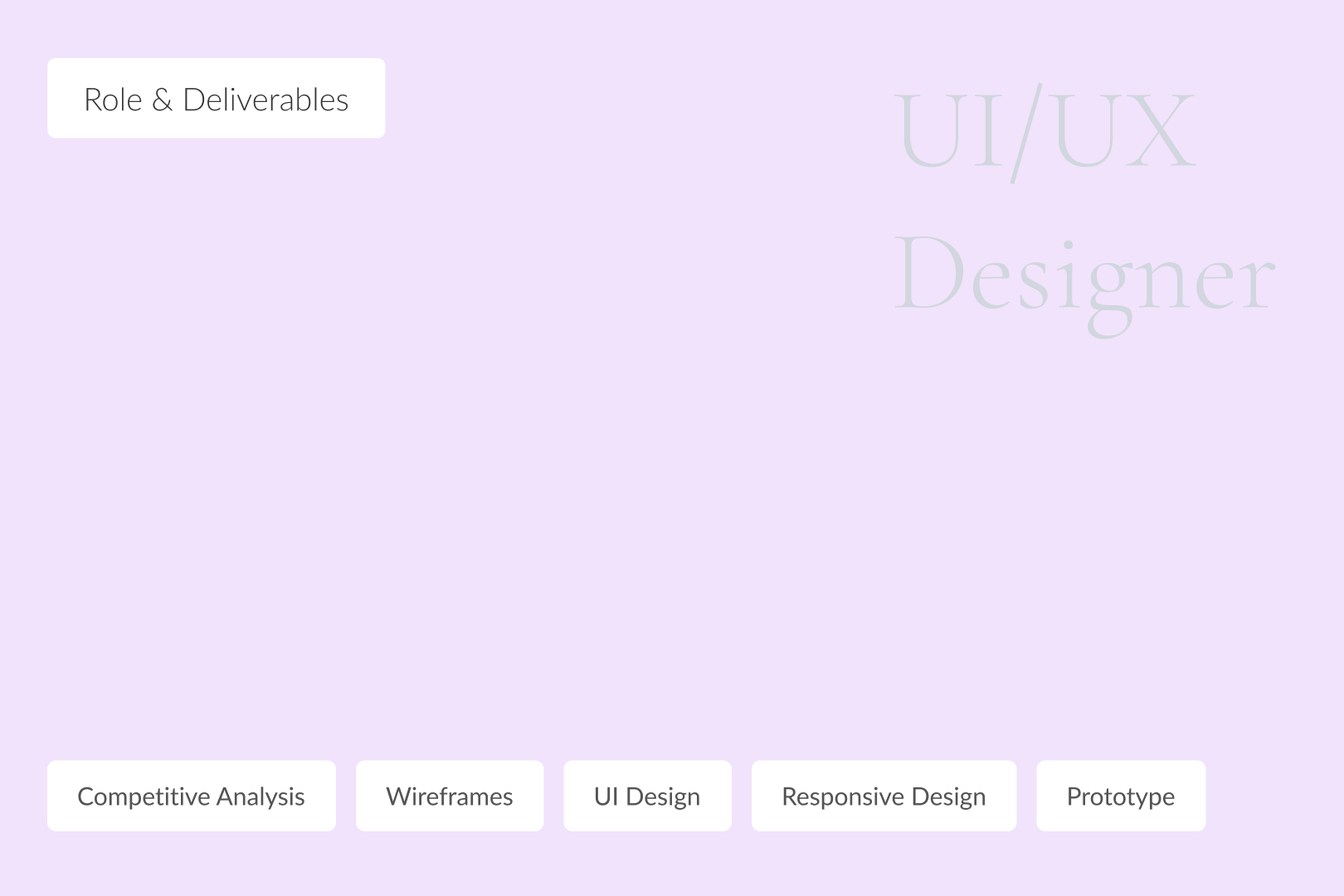
• Created a modern, visually appealing design.
• Improved navigation for a seamless user experience.
View Details ↘
Hifsa Khan Salon is a leading luxury brand catering to high-end clientele. Their previous website failed to reflect their premium image, lacked modern functionality, and offered a subpar user experience.
• Outdated and cluttered design that didn’t align with the salon’s luxurious identity.
• Lack of responsiveness, making it difficult to use on mobile devices.
• No streamlined booking system, leading to inefficient customer interactions.
Responsive Redesign: Created a sleek, mobile-friendly layout that adapts seamlessly across devices.
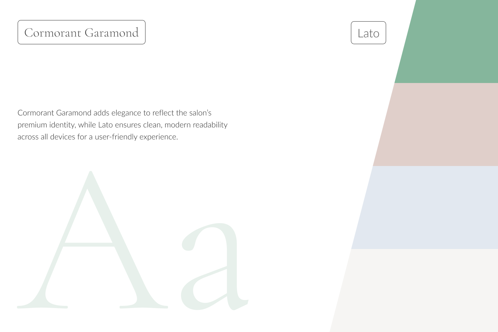
Modern Visuals: Implemented a sophisticated design aesthetic with elegant typography, a refined color palette, and high-quality imagery.
Integrated Booking System: Developed an easy-to-use booking feature, making it convenient for customers to schedule appointments.
User-Friendly Navigation: Simplified navigation to enhance the browsing experience and ensure quick access to key information.
.png)
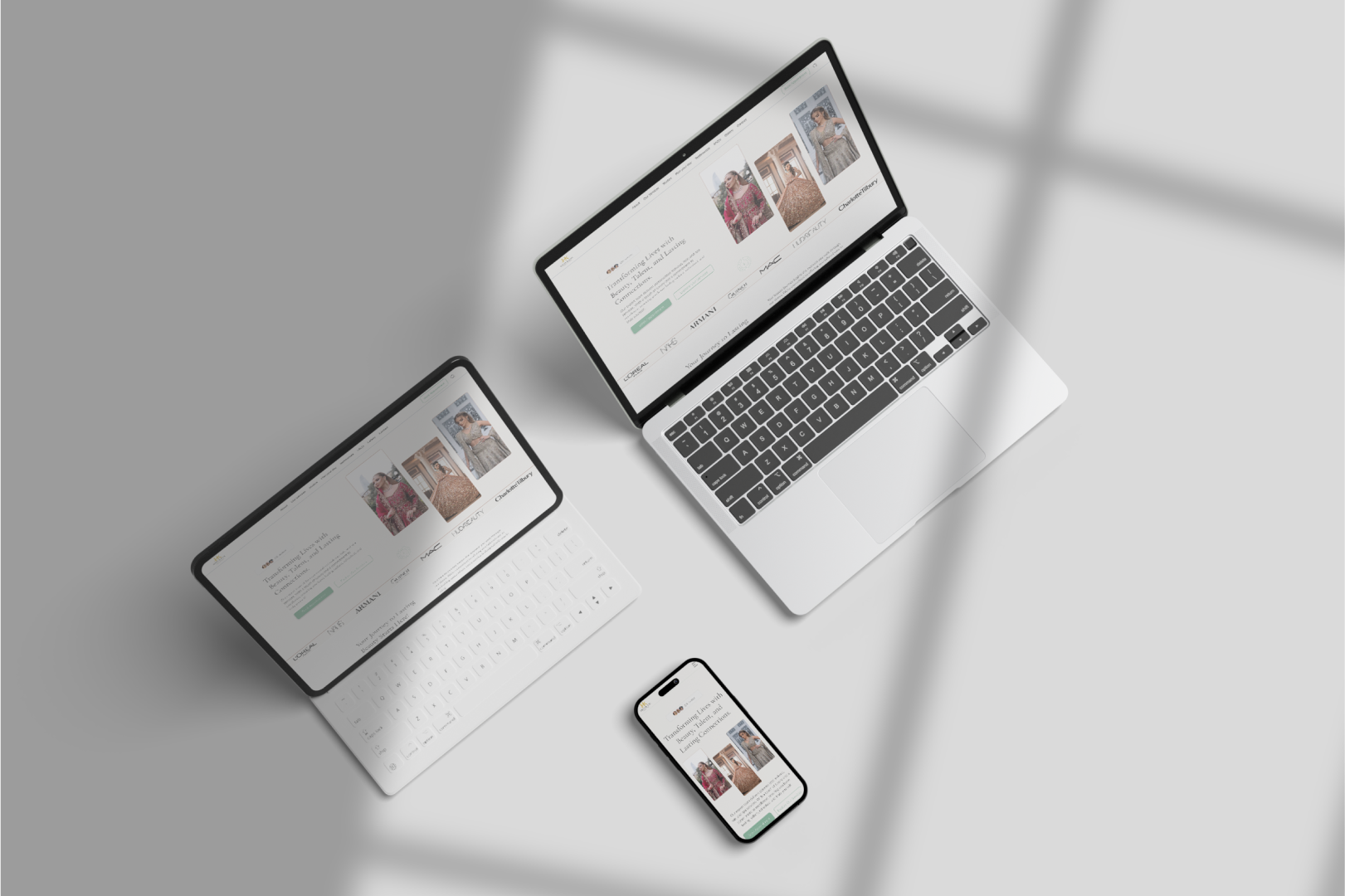
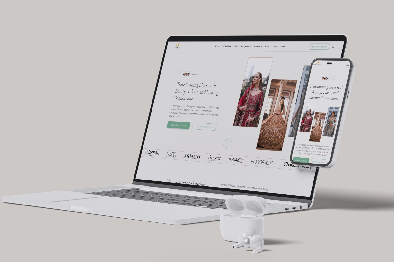
The redesign transformed the salon’s digital presence, enhancing usability and aligning with the brand’s premium image. It provided customers with a smoother experience, reinforcing trust and professionalism.
Let's Bring life to your Brand• Revamped a fintech app for better user experience and accessibility.
• Introduced highly requested features, improving functionality and engagement.
View Details ↘
Faysal Digibank is a leading fintech app serving users across various financial needs. However, the app struggled with outdated features, poor navigation, and a lack of user-centric functionality, making it less competitive in a rapidly evolving digital landscape.
Outdated Design: The app’s interface was visually unappealing and failed to meet modern design standards.
Limited Features: Missing key functionalities like dark mode, account sharing, and enhanced search options.
Complex Navigation: Users found it difficult to locate essential features, leading to frustration.
Modern UI Redesign: Created a sleek, intuitive interface with visually appealing layouts to enhance the app’s usability.
Feature Integration: Introduced dark mode, account sharing, and advanced search options to enhance usability.
Accessibility Improvements: Applied Material Design principles for better inclusivity and user experience.
Simplified Navigation: Streamlined workflows to make essential features easily accessible.
.png)
.png)
.png)
.png)
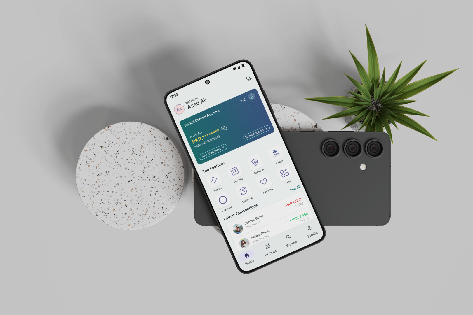
The redesign addressed critical user pain points, delivering a modern, user-centric solution. While specific metrics aren’t available, the app now provides a smoother, more accessible experience, aligning with user expectations and market demands.
View Case Study Details• Revamped the outdated design to create a modern, user-friendly platform.
• Added two new product pages and improved the mobile experience.
View Details ↘
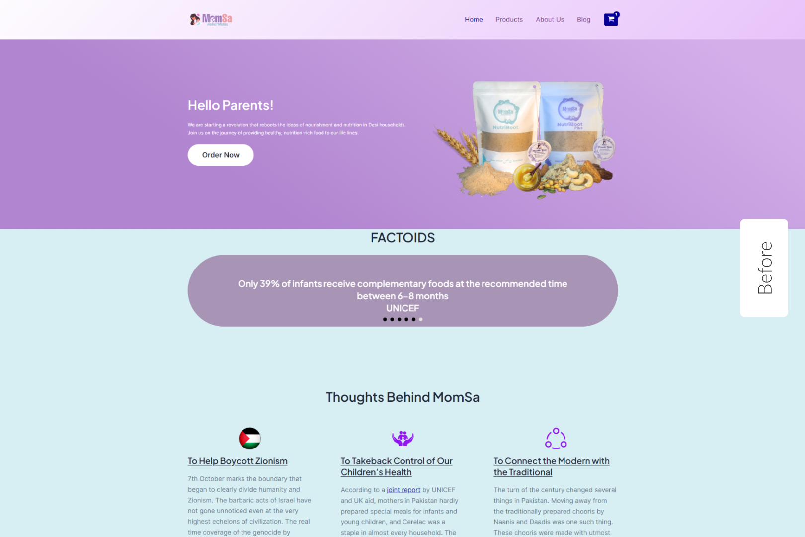
Momsa, a baby food brand specializing in organic, chemical-free products, needed a modern digital platform to reflect its commitment to quality and sustainability. Their existing website was outdated, with scattered information and poor navigation, failing to communicate their mission effectively.
Outdated Design: The website lacked a modern aesthetic and failed to engage users visually.
Scattered Content: Important details like products, testimonials, and brand philosophy were disorganized, leading to confusion.
Limited Product Pages: New product additions were not well integrated into the site.
Poor Mobile Experience: The website was not optimized for mobile users, limiting accessibility.
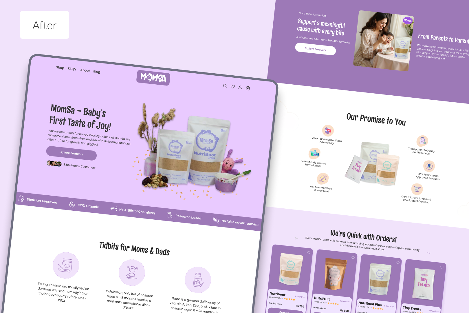
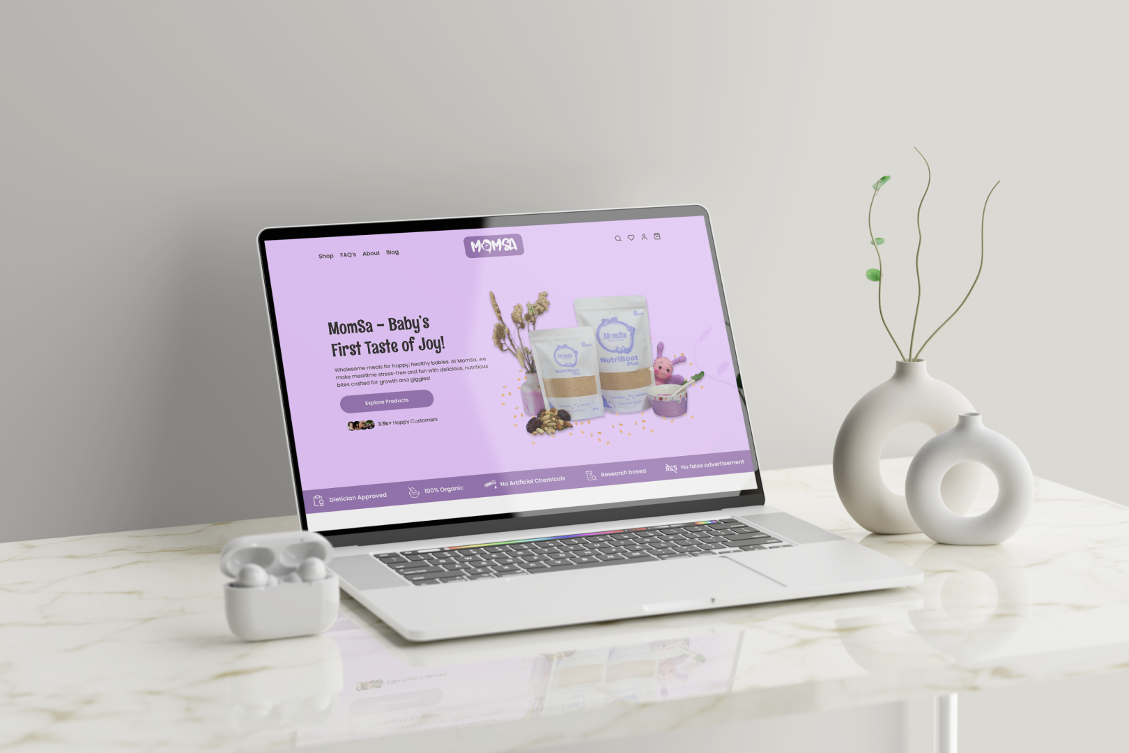
Modern UI/UX Redesign: Delivered a fresh, visually appealing design that highlights Momsa’s commitment to health and sustainability.
Centralized Information: Organized key content into intuitive sections, such as "Our Promise," "Products," and "Testimonials."
Product Page Expansion: Designed two additional product pages to showcase new offerings with clear descriptions and pricing.
Mobile Optimization: Developed a responsive design for seamless browsing across all devices.
.png)
The redesigned website provided Momsa with a professional, user-friendly platform that aligned with its mission. The intuitive navigation, enhanced product pages, and mobile responsiveness created a seamless experience for customers, strengthening the brand’s online presence.
Let's Bring life to your Brand• Designed a fresh, professional website from the ground up.
• Focused on showcasing services, portfolio, and clear CTAs.
View Details ↘
Auryon is a Dubai-based digital agency providing creative and strategic services. As a new agency, they needed a professional online presence to establish credibility, attract clients, and showcase their expertise.
No Existing Website: Starting from scratch required building a brand-aligned digital presence.
Establishing Credibility: The website needed to reflect the agency’s professionalism and expertise to appeal to potential clients.
Effective Structure: Clear communication of services, case studies, and a seamless user journey were essential.
Custom Design: Created a professional, visually engaging layout tailored to Auryon’s brand identity.
Service Highlighting: Designed distinct sections to communicate services clearly and effectively.
Portfolio Integration: Built an interactive portfolio section to showcase projects and capabilities.
Responsive Design: Delivered a mobile-first design to ensure accessibility across all devices.
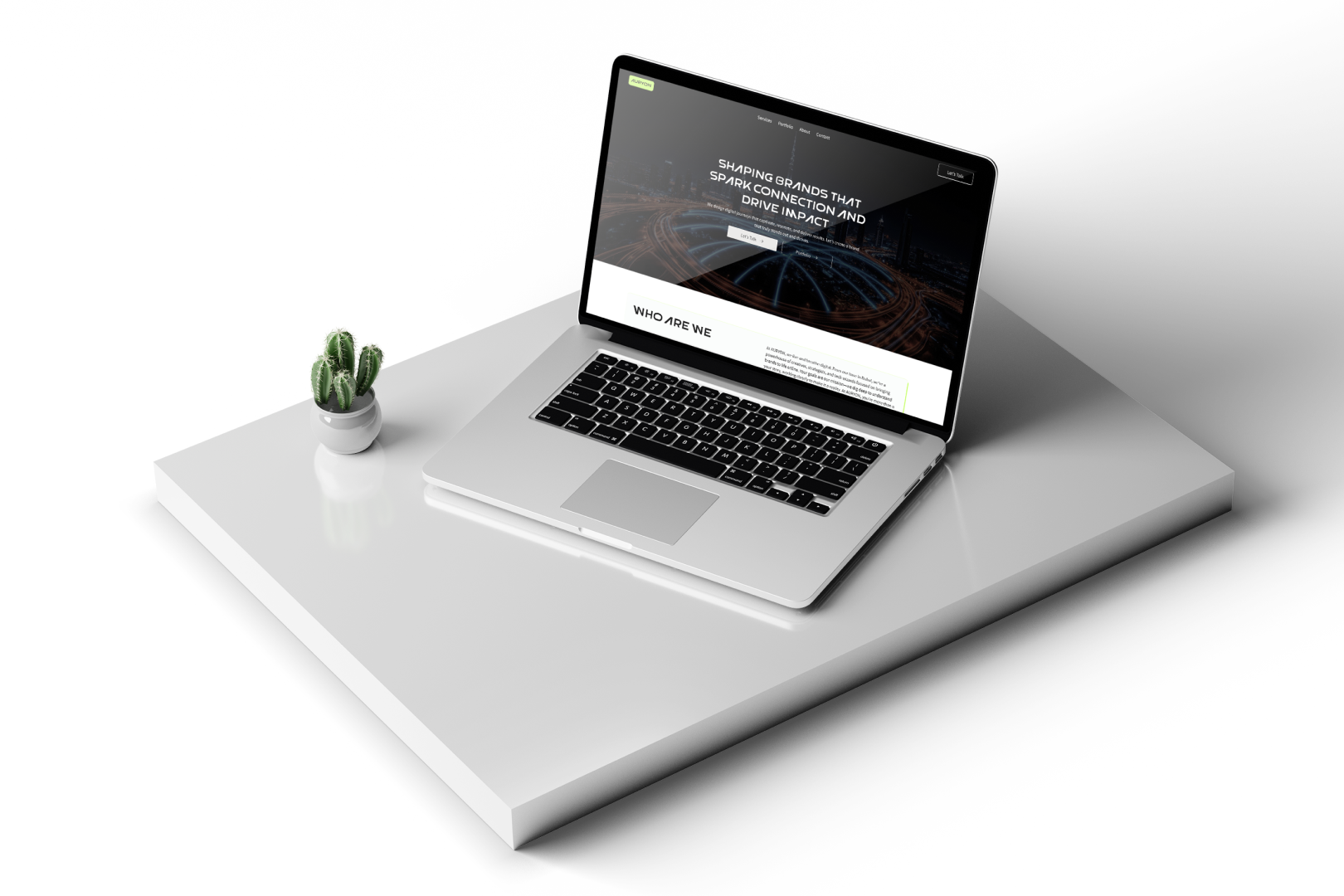
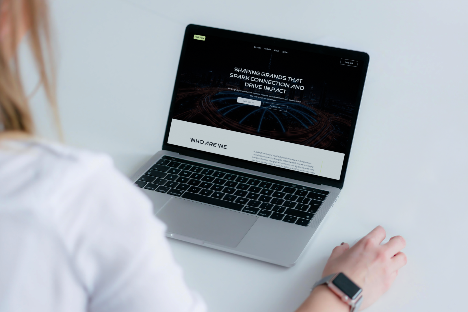
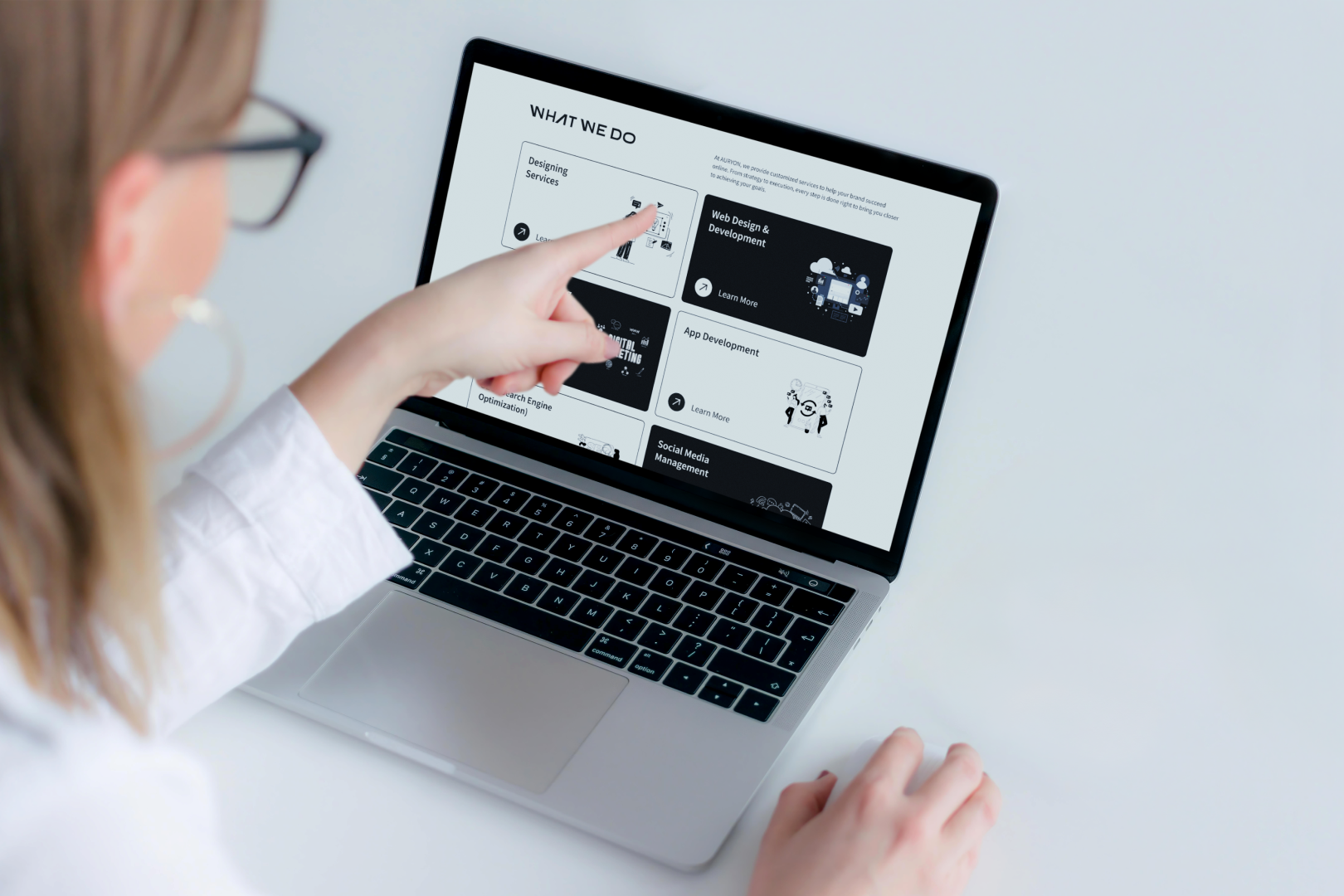
The brand-new website positioned Auryon as a credible and professional digital agency. With a clear structure and engaging visuals, the website now serves as a powerful tool for attracting and converting clients.
Start Your ProjectA digital canvas of my work and passion, showcasing my expertise in UI/UX design and Webflow development.
Let's Bring Life to your Idea!